
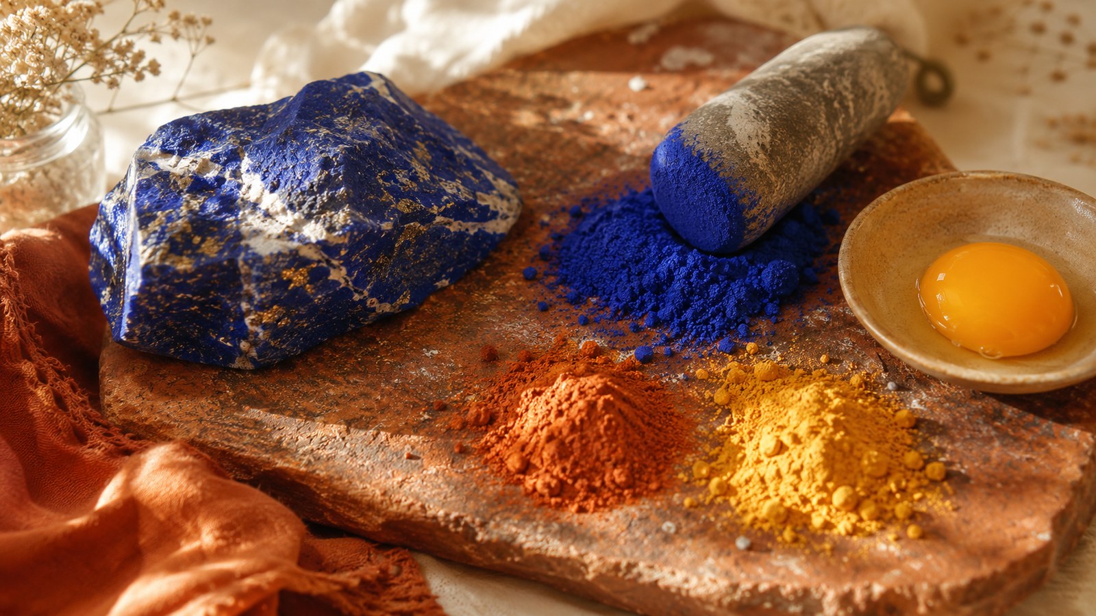
The Blue in a 1520 Painting Cost More Than Gold, and Came From One Place on Earth
Of Titian's Bacchus and Ariadne, painted between 1520 and 1523, the book records this:
"Ultramarine, made by grinding the mineral lapis lazuli, was then available only from Afghanistan. More costly than gold, it is used here with conspicuous extravagance and dramatic effect."
More costly than gold.
Notice the "then": that sentence is about the sixteenth century, not about today. Notice too what it doesn't carry: no figure, no ratio, no date for the price. The book makes the comparison and stops, and I'll stop with it.
Where that painting was going to hang
In a small private room.
"Titian's colorful masterpiece is one of three mythological works he painted for the study of Alfonso d'Este, Duke of Ferrara."
One man's study. Not a church, not a hall. The room he worked in.
Something I wanted and the book doesn't give: anything at all about that room. Not its size, not what else was in it, not whether the three hung together, not what the other two were. It says "for the study" and never returns.
The other pigment comes with an exact quantity
This is my favourite fact in the whole chapter, and it arrives in a picture caption.
Of Charles V on Horseback, 1548:
"For the lush reds, Titian ordered half a pound of 'burning ... splendid' crimson lake pigment from Venice."
Half a pound. Roughly 230 grams, by my conversion, since the book gives pounds.
And again, what it doesn't say is nearly as interesting: it doesn't say who Titian ordered from, doesn't say what crimson lake was made of, doesn't say what it cost, and doesn't identify who is being quoted in that "burning ... splendid". The quotation marks and the ellipsis are the book's. There is no letter, no inventory, no date.
A methodological note I want to make: that fact sits in a caption, not in the running text. In this book a caption is a rung below body text in rigour, and I would rather flag that than pretend everything carries equal weight.
Free
Take the Christmas table checklist
It arrives straight away. After that, my newsletter — leave whenever you like.
Why Venice painted the way it did
Here the explanation is entirely material, which is why I liked it so much.
The climate. "While a hot, dry climate enabled the tradition of fresco painting to flourish in Tuscany, the dampness of Venice was unsuitable for frescoes."
The port. "However, there was a good supply of canvas, thanks to Venice's sailcloth industry. Working in oils on canvas, Venetian artists developed their own distinctive, painterly style."
The surface of Venetian painting came out of the shipping trade. Sailcloth.
One caution: the book links damp to the end of fresco, and links the sailcloth industry to the supply of canvas, but it never says the damp caused the adoption of oil. The chain stops one link short, and I'm not closing it on its behalf.
And trade. "Sea trade with the East also brought luxury goods including exotic spices, dyes, and pigments." Among them lapis lazuli itself, plus realgar, which gives orange, and orpiment, which gives yellow. Both arsenic-based, and both, the book says, "popular with Venetian painters. They created glowing golden colors."
The minerals were "ground into pigments, and mixed with egg to create egg tempera, or with oil."
Water as a light source
The section's own subtitle is literally "COLOR AND LIGHT", and the explanation is beautifully plain:
"The water itself brought color and reflected light." And: "Colorful buildings reflected in the canals created flowing, shifting colors that found echoes in Venetian painting."
The ships also brought back "exotic multicolored marbles, flecked with purples, reds, and greens."
A city built on a mirror, supplied by a port that unloaded colour.
Glass belongs here too, because glass belongs everywhere in that lagoon: the book records that "even the local craft of glassblowing" influenced the painting, and compares one painted landscape "to the flowing color of Venetian glass of the period." I've written before about why the glass furnaces were thrown out of the city and ended up on an island; this post is the other half of what that port produced.
The first dawn
There's a sentence in this chapter I can't shake, and it needs careful attribution.
Of Giovanni Bellini's The Agony in the Garden, c.1460–65, the book says he "sets the scene as day is breaking: the sky glows pink, and the golden light of dawn envelops the landscape and figures", and calls it "the first known dawn in Italian painting."
The first known dawn. It is the loveliest line in the chapter and also the most fragile, because "the first known" is the kind of claim a single redating overturns. So I'm attributing it: the book says that, not me.
It also offers no symbolic reading of the dawn at all. It treats it as a technical achievement and moves on.
Who paid
Two sources, according to the book: "Important artistic commissions came from the State and from the scuole — charitable organizations that also functioned as social clubs for Venetian citizens."
Social clubs, commissioning enormous pictures. And the detail that closes it: the paintings "featur[e] portraits of the scuola members." The people who paid are painted inside the room they paid for.
"Artists were paid in Venetian ducats, one of the strongest currencies in Europe." No sum is given. Nowhere in the chapter.
What this teaches me about setting a table
Two things, and the first is a permission.
The expensive colour is for using sparingly and on purpose. The blue in Bacchus and Ariadne isn't scattered across the picture. It occupies one vast expanse at the top left, and the red and pink are thrown against it. One place, chosen.
A table works the same way. The good piece, the inherited one, the expensive one: one of them. In the right spot. Everything else holds it up.
And a table looks like where it is. Venice painted with what the port unloaded, on sailcloth, because the climate wouldn't let anyone paint on a wall. That wasn't an aesthetic decision. It was geography.
Which is worth remembering when the pictures you're copying come from somewhere with a different climate and a different market. Use what your own harbour brings in.
If you want the rest of what we're building for the season — Thanksgiving on 26 November as much as December — it's all gathered on one page.
And if you want the table piece that adds care and costs nothing: The Art of Napkin Folding has the classic folds step by step. R$ 47.00, lifetime access.
Tell me what your expensive colour is, the one that appears rarely and always in the same place. Here it's a blue china that only leaves the cupboard once a year.
Free
Take the Christmas table checklist
Everything that matters on a Christmas table, on a single sheet. Print it, or fill it in on your computer.
It arrives straight away. After that, my newsletter — leave whenever you like.