
The room you're putting together right now will have its manufacture date stamped on it
There's a line in a decorating book that made me uncomfortable in the useful way.
A designer remarks that some people fill handsome old houses with whatever furniture is current — and that over time those rooms become a time capsule of what was popular that year. They don't end up classic or modern. They end up dated.
I looked at my living room and thought: 2019. You can see the year from here.
And the good part is that the book's answer isn't "don't follow trends", which is useless advice. It's more specific than that.
The fourteen-year-old house that reads as timeless
The example that opens the chapter is a renovation.
A designer describes people walking in and refusing to believe the house is only fourteen years old. The reason she gives is blunt: in the renovation, everything was done the way it would have been done in the 1920s or '30s — so the house doesn't shout "last year".
It isn't that the house pretends to be old. It's that it doesn't stamp a date.
The detail I liked: the ceilings were built from old pine salvaged from buildings being demolished. The choice wasn't economy — it was patina, which is the one thing you can't buy new.
That's the same logic as why thrifting beats buying new: time is a finish, and no factory sells it.
And one observation about ceilings I'd never seen written down: once the ceilings were in, the rooms immediately felt more intimate. We decorate walls and floors and treat the ceiling as the white thing up there. It is announcing the size of the room the entire time.
Which layer ages, and which doesn't
Reading the whole chapter, I built a rule the book practises without ever stating.
Expensive layers age slowly. Cheap layers age fast. So the trend belongs in the cheap layer.
| Layer | Lifespan | What to do |
|---|---|---|
| Structure: ceilings, floors, joinery, windows | decades | work in the house's own idiom, not the year's |
| Large furniture: sofa, table, cabinet | 10–20 years | traditional silhouette, quiet colour |
| Textiles: cushions, curtains, covers | 3–8 years | be brave here |
| Small objects, flowers, candles | months | should be brave here |
The mistake that dates a room is inverting it: buying the sofa in this year's shape and the cushions in beige. Then the expensive item is the one giving away the date, and it's the one that stays.
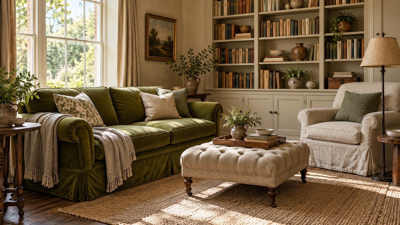
A designer in the book says the same thing differently: her furniture silhouettes are all traditional — classic low slipper chairs, a tufted ottoman, a period armchair — and it's the fabric that makes it feel young. A vivid green velvet on an old-shaped sofa makes the whole thing less serious without compromising anything expensive.
Free
Take the Christmas table checklist
It arrives straight away. After that, my newsletter — leave whenever you like.
Pattern on pattern, and the rule that makes it work
This is the most useful technique in the chapter and it fits on one line.
Mixing several patterns in one room works when all of them share a colour. A designer describes a room of many different patterns that holds together because every one carries the same deep red. He goes as far as treating that red as a neutral.
It isn't about the patterns matching in scale or style. It's about one thread of colour running through all of them.
And the companion rule: when there's a lot of pattern, something large has to anchor. In his case a strongly drawn rug locks the rest in place, and a long piece of furniture behind the sofa acts as a visual anchor.
The white rule, which is actually about laundry
I've taken this one into my life.
A designer built an entire room in white and is frank about the condition: she would never have used white if the covers didn't come off. The slipcovers go on and off constantly, and a stain doesn't set if someone owns up fast enough to deal with it.
It's obvious and almost nobody says it. White isn't an aesthetic decision, it's a maintenance decision. If it comes off, you can. If it doesn't, you can't.
And the warning that goes with it: in a very white room, if everything is delicate it turns saccharine. She balances it with grey, brown, black and heavily textured pieces, so the room doesn't look like it might float away.
Shelves: the method that changes a whole wall
The book has a section putting questions to several designers, and the part about books is the most immediately usable thing in it.
- Line the spines up with the front edge of the shelf, leaving almost no shelf showing in front. That's the difference between a bookcase and a storage unit.
- Arrange by height, but not in ascending order. Make a gentle wave, so the eye travels up and down instead of sliding off.
- Lay some books flat among the upright ones to break the monotony, and use the stacks as plinths for objects.
- Mix objects in among the books, in some loose pattern — distributed, not heaped in one corner.
- Grouping by subject or by colour both work. Colour is faster and reads from further away.
And two ideas I found generous:
The art book on a stand, with the page turned daily. One designer bought a stand, left a favourite book open, and now sees a good photograph every time he walks past. We all own expensive books nobody ever opens.
The dining table that sits idle, turned into a library table. Small stacks of books around the perimeter, one large object in the centre, a small object on top of each stack. In December it goes back to being a dining table in five minutes.
And one practical fact hiding in plain sight
The chapter shows an entrance hall with its walls lined in fabric, tented. I read that as pure luxury until the designer gave her second reason: fabric on the wall muffles street noise.
That explains heavy curtains, thick rugs and upholstered walls in a way that "it feels cosy" doesn't. Acoustic comfort is a real thing, and it's half the reason certain old rooms feel good to sit in.
This book's limits, and they're substantial
I need to be direct: this is a magazine book, not a decorating book.
It's a compilation of photographed rooms with captions, and nearly every page names a specific fabric from an American textile house, with a product code. That's useless here — they're American trade suppliers a Brazilian reader can't buy from.
I stripped all of it deliberately. What's left, and what transfers, is the reasoning: which layer can carry a trend, why pattern on pattern works, why white depends on laundry, how a bookcase is organised.
One more limit: the houses photographed are large and expensive. The logic works in an apartment living room; the square metres don't.
The summary
- The trend goes in the cushion, never in the structure
- Traditional silhouette, brave fabric
- Different patterns get along when they share a colour
- White only with covers that come off
- Spines at the front edge, and a wave rather than a staircase
- If the room feels cold, remember that most of your living room is lived in after six — which changes paint, bulbs and everything else
If you'd like the rest of what we're putting together for the season, I've gathered it all on one page, with a table checklist to download.
And for the table in the middle of that room: The Art of Napkin Folding has the classic folds step by step. R$47.00, lifetime access.
Tell me something: can you guess the year of your living room? Mine gives up 2019 instantly, and now I know exactly which piece is doing it.
Free
Take the Christmas table checklist
Everything that matters on a Christmas table, on a single sheet. Print it, or fill it in on your computer.
It arrives straight away. After that, my newsletter — leave whenever you like.